THESIS PROJECT
Pulse Odyssey was created to address a clear design challenge. It aimed to boost ticket sales and build audience loyalty. It also needed to stand out in an over-saturated concert market. Pulse Odyssey uses a carefully researched and strategically executed brand system. This system transforms one-time attendees into lifelong fans. It does so by delivering a bold, electrifying, multi-sensory experience.
Onlyness Statement
Early Mishap
First Attempt:
The benefit promised is a thrilling, sensory-packed experience that stimulates the audience through high-energy performances, immersive visuals, and intense music. The features that provide this benefit include light shows and bass drops. Interactive technology is also designed to keep the audience energized and engaged. These features cater directly to the audience’s need for stimulation. They offer an environment where they can be immersed in the experience.
This version was too feature-driven and sounded like an advertisement, not a strategic, differentiated brand foundation.
The initial draft promised a thrilling, sensory-packed experience through high-energy performances, immersive visuals, and intense music. Features such as light shows, bass drops, and interactive technology were described as delivering audience stimulation and engagement.
How the Ideas Were Refined:
This early version fell into the common pitfall of sounding like advertising copy. It did not establish a differentiated brand position. Instead of defining Pulse Odyssey’s unique space in the market, it merely listed features and benefits. It focused on what the experience offered. It did not explain why it was unique.
According to Jasmine Star’s Branding Your Creative Business course (2022), a brand’s foundation must:
- Define who is uniquely served.
- Highlight the emotional transformation only the brand can offer.
- Clarify why the brand is the obvious, only choice.
Closer, but Still Too Emotional and Wordy
Second Attempt:
For young adults seeking a bold, once-in-a-lifetime experience, Pulse Odyssey delivers the most electrifying EDM concerts that ignite the senses. The concert features cutting-edge light shows and heart-pounding bass drops. Vibrations pulse through your body. Every moment captivates your sight, sound, and touch. Pulse Odyssey isn’t just a concert. It’s a journey that pushes limits. It has you surrendering to sensations you’ll never forget. This is where unforgettable memories are made, and the night comes alive like never before.
This version had too many sensory descriptions diluted the clarity of the brand’s core Onlyness.
The revised version described Pulse Odyssey as delivering “the most electrifying EDM concerts that ignite the senses.” It captures a vivid sensory journey. There are cutting-edge visuals and immersive bass experiences. It positioned Pulse Odyssey as a bold, unforgettable adventure for young adults.
How the Ideas Were Refined:
This attempt made clear improvements:
- Identified the target audience (young adults).
- Built emotional resonance through sensory storytelling.
- Differentiated from ordinary concerts.
However, it remained too descriptive and emotional, resembling emotional advertising more than a strategic brand position. Following Stefan Mumaw’s advice from Brand Strategy for Designers (2022), strong brand statements should:
- Avoid sales-heavy, flowery language.
- Quickly connect to the core emotional truth.
- Prioritize clarity over poetry.
This version still diluted the brand’s Onlyness by prioritizing sensory description over sharp brand differentiation.
Steps Taken to Finalize the Design:
- Simplify emotional language without losing resonance.
- Strip down to the brand’s core offering and emotional space.
- Shift from poetic description to direct, ownable language.
A Clean Onlyness Statement
Final Statement:
Pulse Odyssey offers young adults a sensory experience with light shows, powerful bass drops, and vibrations you can feel. It’s a sensory journey that brings the night to life.
The final statement focuses tightly on sensory experience and emotional impact. It does not emphasize just features. It positions Pulse Odyssey as the definitive brand offering a full-body, sensory EDM journey.
How the Ideas Were Refined:
The final statement cuts directly to the core offering, a full-body sensory EDM experience. It also maintains emotional resonance. It clearly identifies:
- What the brand offers (a sensory journey).
- Who it serves (young adults).
- What emotional transformation it promises (bringing the night to life).
Final Solution – Steps Taken:
- Removed excessive sensory adjectives and over-description.
- Tightly aligned the offering with emotional impact.
- Crafted a short, direct, emotionally charged statement.
Research-Based Validation:
- Debbie Millman (2020): Strong brand positioning must be short, emotionally resonant, and immediately understandable. The final statement captures this perfectly by being concise, specific, and emotionally vivid.
- Von Glitschka (2021): Branding must lead with emotional differentiation and create a mental space that the brand uniquely occupies. Pulse Odyssey now owns the idea of a sensory journey that transforms a night into a full-body experience.
Voice & Tone Development for Pulse Odyssey
Early Voice Narrative Focused on Experience Descriptions
First Attempt:
The initial narrative for Pulse Odyssey was designed to express the brand’s core themes of stimulation and engagement. The language highlighted how EDM experiences stimulate multiple senses. It used phrases like “ignite the senses” and “captivate your sight, sound, and touch.” This aligned with research from UC Press (2019). The research explains how EDM events create immersive atmospheres through sound, visuals, and physical effects. Specific sensory details, such as bass vibrations and confetti explosions, were highlighted to illustrate the experience.
How the Ideas Were Refined:
This first attempt successfully captured the sensory elements. However, it leaned heavily into descriptive storytelling. It did not establish a recognizable emotional rhythm or stylistic identity.
Stefan Mumaw’s (2022) insights from Brand Strategy for Designers provided clarity. An effective brand voice must move beyond listing features.
Formalization of Voice and Tone into Style Guidelines
Second Attempt:
This draft began the visual and verbal structure for Pulse Odyssey’s voice and tone:
- Voice Description: Bold, rhythmic, futuristic, immersive.
- Writing Style Principles:
- Concise & Impactful – Sentences punchy like a beat drop.
- Rhythmic & Fluid Wording that builds movement and tension.
- Futuristic & Bold – Reflects cutting-edge technology and energy.
- Inclusive & Collective – Messaging that unifies and energizes the crowd.
- Key Phrases: “Welcome to the sonic void,” “Feel the Bass. Join the Movement,” and “Pulse-Pounding Beats.”
How the Ideas Were Refined:
The second draft shifted from pure sensory description. It moved to deliberate stylistic control. This change reflects how the brand should feel in language. This transition aimed for a punchy, rhythmic writing style. It was influenced by Debbie Millman’s Introduction to Branding (2020). Millman emphasizes that a brand’s voice should mirror its emotional essence, not just its features.
Steps Taken to Finalize the Design:
- Created brand-specific phrases to build linguistic recognition.
- Defined voice attributes linked to brand pillars (energy, technology, inclusion).
- Outlined specific writing principles to guide consistency.
Final Voice and Tone Statement
Final Voice and Tone:
Pulse Odyssey’s voice is bold, rhythmic, and immersive, designed to capture the high-energy, futuristic essence of the brand. Every message builds momentum, heightens anticipation, and pulls the audience deeper into the Pulse Odyssey universe. Our tone is confident, electrifying, and inclusive. It speaks with the pulse of the music. We invite every listener to join a movement larger than themselves.
How the Ideas Were Refined:
The final voice and tone statement transitioned from structure-building to emotional integration. This shift ensures every message feels like an extension of the brand’s live experiences. It no longer simply describes or suggests; it invites and energizes.
Final Solution – Steps Taken:
- Tightened the voice description into a compact, highly memorable paragraph.
- Ensured the tone not only describes the brand essence but actively channels its energy.
- Used action-based phrasing (“builds momentum,” “inviting every listener”) to deepen audience connection.
- Matched the rhythm and cadence of EDM itself — concise, accelerating, and intense.
Research-Based Validation:
- Debbie Millman (2020): Branding should reflect how a brand feels, not just what it offers. The final version achieves emotional resonance through rhythm, boldness, and invitation.
- Stefan Mumaw (2022): Brand voice must establish emotional cadence. The final writing style mirrors the sonic momentum of EDM.
- Von Glitschka (2021): Voice must extend customer emotional experience. Pulse Odyssey’s tone turns communication into an invitation to participate, reflecting audience expectations of energy and belonging.
- Wheeler (2017): Modern brands must foster community. Inclusive phrasing like “inviting every listener to join”satisfies the need for collective identity.
Look & Feel: Color Palette
Initial Concept Focused on Emotional and Cultural Meaning

Recognizing this limitation, the refinement process focused on achieving color consistency across both digital and real-world applications.
First Attempt:
The original Pulse Odyssey color palette featured neon green, purple, and complementary accent tones. The goal was to consistently apply these primary colors across all media. This aimed to evoke the electrifying, high-energy atmosphere of an EDM experience.
Colors were selected for their ability to glow in dark environments. They stand out, making them ideal for digital, print, and live event applications. Each shade contributed to a unified brand vibe: immersive, bold, electrified, and unforgettable. Neon green and purple carry strong cultural significance in the EDM community. As noted in What Are Color Genres? (2021), these colors are iconic in electronic subcultures, symbolizing expressive individuality and the vibrant nightlife experience.
How the Ideas Were Refined:
While conceptually strong, the initial palette was limited to digital execution. It did not fully account for the technical challenges of translating bright neon colors into physical print formats.
Technical Refinement for Real-World Consistency

By addressing technical considerations early, Pulse Odyssey’s palette now ensures professional-grade consistency. It also guarantees multi-platform readiness. Additionally, it provides visual impact across both screen-based and physical media environments.
Second Phase:
A major technical refinement was achieved. The team shifted from an RGB color space (optimized for screens). This moved to a CMYK color space (essential for print-based media). This conversion ensured that the vividness of Pulse Odyssey’s colors would remain consistent. Their impact would be maintained across both digital and physical formats.
How the Ideas Were Refined:
Converting to CMYK early in the production pipeline:
- Preserved color vibrancy for posters, flyers, merchandise, and event signage.
- Prevented color shifts and dullness that often occur when RGB files are printed without adjustment.
- Aligned with best practices for brand consistency across all mediums.
Steps Taken to Finalize the Design:
- Adapted neon tones to CMYK safe equivalents while preserving the intended emotional impact.
- Created print and digital versions of the palette to guarantee visual integrity.
- Verified colors with professional print tests to ensure vibrancy and brand fidelity.
Research-Based Validation:
- Von Glitschka (2021): Brand Identity Design emphasizes that brand integrity demands technical precision, especially in maintaining color fidelity across formats.
- Alina Wheeler (2017): Designing Brand Identity stresses that consistent color reproduction is critical for building audience trust and brand recognition.
Look and Feel: Typography
Selected Fonts:
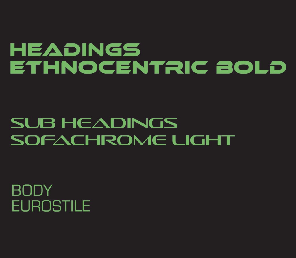
Ethnocentric was chosen for headings because it conveys a futuristic, digital, high-impact feeling. It matches the bold, energetic brand promise of Pulse Odyssey. According to Mumaw (2022), heading typefaces for entertainment brands must immediately capture attention and reflect the genre’s emotional energy.
Sofachrome complements Ethnocentric with a sleek, high-tech look for subheadings, keeping visual energy while maintaining readability.
Eurostile provides a professional, clean body copy foundation. It has subtle sci-fi undertones. This ensures readability across print, digital, and mobile environments. These attributes align with best practices for hierarchy and accessibility (Glitschka, 2021; Wheeler, 2017).
Fonts Considered but Not Selected:

1. Kallisto
According to Millman (2020), typeface personality must match brand emotional territory. Kallisto’s friendliness felt too muted for a brand needing intense sensory engagement, too soft and rounded for the brand tone. Kallisto’s organic curves create a contemporary but friendly, casual tone, which does not match Pulse Odyssey’s high-energy, futuristic, sensory-driven experience.

2. BD Geminis
Too experimental and distorted. BD Geminis has an extreme techno, distorted appearance that sacrifices legibility, especially in medium or smaller applications. As Mumaw (2022) notes, legibility should never be compromised for style. This is especially true for core branding applications like signage, merchandise, and social media. BD Geminis would make long-form reading and brand recall more difficult.

3. Fit
Overly compressed and decorative. Fit is extremely condensed and blocky. This style can be visually exciting but sacrifices readability. It feels better suited for logos or wordmarks, not a full brand system. According to Glitschka (2021), functional typography must balance creativity with readability, particularly when scaled across different platforms and print sizes. Fit would not adapt well beyond short headlines.
Look and Feel: Line & Shape:
Line Integration into Visual Language:
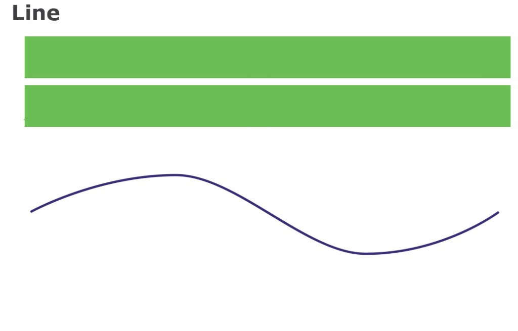
The initial line exploration focused on basic, horizontal forms and singular wave patterns. This approach was visually clean. However, it lacked the emotional resonance and depth needed. It failed to represent the layered experience of an EDM concert.
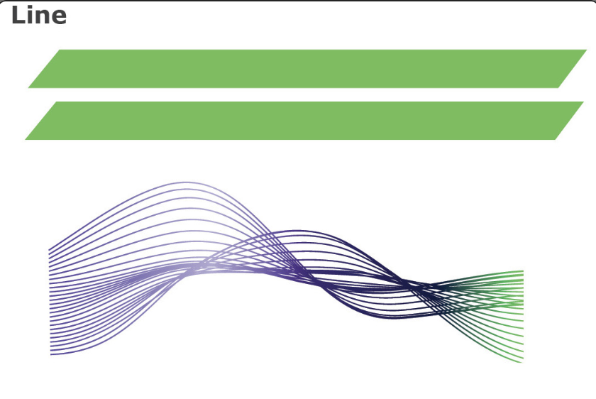
Through deeper brand analysis, the visual system was transformed to be more expressive and intentional:
- Duality of form—sharp, structured lines represent technical precision (event production), while organic, flowing curves suggest audience freedom and movement.
- Simple geometric enhancements—triangles symbolize forward momentum, while circles evoke unity and community.
- Layered line patterns—inspired by Glitschka’s (2021) principle that brands must communicate emotionally through patterns, not just words.
This refined system addresses the brand’s core problem. It creates a dynamic, emotionally immersive identity. This identity commands attention and fosters connection in a saturated EDM market.
Shape Integration into Visual Language:

In addition to lines, Pulse Odyssey’s visual identity incorporates simple geometric shapes. These include triangles and circles to extend its themes of energy, unity, and transformation.
- Triangles symbolize direction, momentum, and dynamic energy, aligning with the brand’s commitment to pushing audiences forward into immersive experiences. Triangles visually reinforce progression and tension, essential traits of electronic music’s rising energy patterns (Millman, 2020).
- Circles represent unity, community, and endless sensory loops. They echo the cyclic rhythms found in EDM beats. These rhythms are also found in communal concert experiences (Glitschka, 2021).
Pulse Odyssey uses a minimal but intentional shape language. This approach creates a system that is immediately recognizable. It is also emotionally resonant with the brand’s futuristic and sensory identity.
Integration into Brand Pattern:

The Pulse Odyssey brand pattern strategically combines line and shape into a repeating, rhythmic motif:
- Structured parallel lines and curved waves create flow, tension, and movement, visually echoing the soundscape of EDM.
- Repeating triangles and circles provide visual rhythm and emotional symbolism. They create a pattern that feels electrified, layered, and multi-dimensional. It feels just like the event itself.
According to Von Glitschka (2021), effective brand patterns should:
- Extend the core brand identity without distracting from it.
- Reinforce emotional themes (e.g., energy, unity, motion) across different materials (merchandise, stage visuals, social media).
- Create sensory consistency, so audiences feel the brand before reading a word (Glitschka, 2021).
Research-Based Validation:
Cultural Alignment: EDM culture values motion, community, and sensory overload. Pulse Odyssey’s fluid linework and repeating rhythmic patterns are instantly recognizable. They are culturally appropriate, creating stronger audience alignment.
Movement and Rhythm: According to DesignMantic (2021), using lines to suggest rhythm and progression creates visual energy. This energy mirrors sound. Pulse Odyssey achieves this through its combination of structured and organic lines.
Emotional Engagement: Millman (2020) states that emotionally resonant visual systems enhance brand connection. Pulse Odyssey deepens emotional storytelling by introducing shapes that symbolize momentum (triangles) and unity (circles).
Brand Recognition and Flexibility: Glitschka (2021) emphasizes that versatile brand systems must work across formats. Pulse Odyssey’s pattern maintains energy and clarity whether projected on massive stage screens or printed on merchandise.
Look and Feel: Texture and Imagery
Original Concept – Emphasis on Sensory Elevation

First Attempt:
The original visual system for Pulse Odyssey focused on highlighting a sensory-driven experience. This was achieved through vibrant light displays, dynamic crowd scenes, and layered geometric projections.
Key visual elements included:
- Triangular forms symbolizing energy and dramatic musical tension.
- Circular patterns reflecting harmony and perpetual motion (Iakovlev, 2021).
- Smoke effects, radiating beams, and layered textures create tactile dimensionality (Theodor, 2023).
These visuals effectively captured the brand’s focus on sensory elevation. They align with Reid’s (2023) assertion that effective imagery should evoke emotional resonance. Imagery should also support brand storytelling.
How the Ideas Were Refined:
The initial approach was visually striking. However, it relied too heavily on environmental spectacle, large festival crowds, intense light shows, and chaotic overlays. It did not foster emotional intimacy or personal transformation.
- Debbie Millman (2020): Great branding must pull audiences emotionally into the experience, not just showcase external environments.
- Von Glitschka (2021): Visual texture and imagery must evoke internal emotional connection, not just surface-level excitement.
Problem Identified:
The first iteration lacked the emotional intimacy needed. It also lacked tactile depth. Additionally, it needed sensory transformation. These were required to fully align with Pulse Odyssey’s brand promise of immersive, personal experience.
Final Solution

The refinement of Pulse Odyssey’s textures and imagery changed its focus. It moved from environmental spectacle to a deeply immersive, sensory-driven experience. This new approach created an emotionally intimate experience. The final imagery system integrates tactile textures, candid emotional moments, dynamic compositions, and consistent color usage. This integration successfully embodies the brand’s promise: to transform an EDM night into a full-body, emotional journey.
Texture Refinement:
- Replaced chaotic textures (confetti, broken overlays) with fluid, iridescent, and cosmic textures that simulate sensory immersion.
- Introduced galaxy-inspired visuals, resin-like fluid textures, and atmospheric depth to bridge sight and touch.
Imagery Refinement:
- Moved from wide-angle festival crowd shots to high-energy, candid, close-up moments.
- Focused on personal freedom, transformation, and euphoric movement.
- Integrated UV body art, mirror ball reflections, and cosmic glow effects to create movement resonance.
Compositional Focus:
- Emphasized shallow depth of field and dynamic camera angles. Used glow-based lighting to create visual entry points. These elements pull viewers into the Pulse Odyssey experience.
Brand Palette Consistency:
- Final imagery strictly adheres to Pulse Odyssey’s brand color palette
- Maintains emotional and visual brand coherence across all mediums.
Research-Based Validation:
Tactile Experience:
- Theodor (2023): Layered, dimensional textures heighten sensory immersion. Pulse Odyssey’s fluid, iridescent surfaces visually simulate touch and resonance.
Emotional Resonance:
- Reid (2023): Imagery must evoke emotional connection, not just depict events. Final imagery centers on personal awe, human connection, and transformational moments.
Cultural Alignment:
- Iakovlev (2021): Geometric shapes (triangles for momentum, circles for unity) reinforce rhythmic brand experiences. Pulse Odyssey’s compositions deliberately echo these symbolic forms.
Audience Sensory Activation:
- Millman (2020): Sensory-driven brands must create synesthetic visual experiences. The final cosmic, ultraviolet visuals achieve multi-sensory stimulation through sight, perceived texture, and emotional energy.
Brand Vision Board
Original Concept – Informational Display over Emotional Immersion
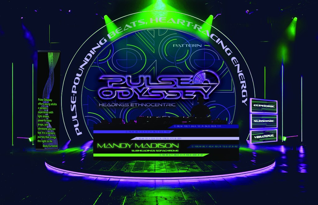
Problem Identified: The first board visually captured excitement. However, it failed to emotionally immerse the viewer. It also did not clearly communicate Pulse Odyssey’s sensory-driven brand story.
First Attempt:
The original Pulse Odyssey vision board brought together all brand elements. It included the logo, color palette, typography selections, and pattern. These were combined into a high-energy concert environment simulation.
How the Ideas Were Refined:
Despite being energetic, several challenges were identified:
- Legibility Issues: Small fonts and low-contrast color combinations were difficult to read, especially against dark, complex backgrounds.
- Visual Density: Overcrowding of brand elements created clutter and reduced overall visual impact.
- Disconnected Messaging: The board emphasized the event environment rather than the personal, sensory transformation that Pulse Odyssey promises.
Following guidance from Wheeler (2017) and Millman (2020), it became clear that a brand vision board must:
- Instantly evoke emotional experience.
- Make the audience feel the brand’s essence at first glance, not just display information.
Final Solution – Refining the Vision Board

The evolution of Pulse Odyssey’s vision board changed significantly. It moved from a visually crowded, informational display to a powerful emotional gateway. This gateway leads into the brand’s sensory-driven experience. The final board focuses on emotional storytelling, visual clarity, sensory immersion, and cultural alignment. It now visually communicates the brand’s essence at a glance. This captivates and immerses the audience in Pulse Odyssey’s unique world.
Focused on Emotional Storytelling:
- Integrated tactile textures, emotionally charged imagery, and evocative copy centered around awe, freedom, movement, and immersion.
Simplified the Composition:
- Organized the board into clear, focused sections:
- Top: Dominant placement of the logo and emotional tagline. Strategic layout of brand colors with ample negative space.
- Middle: Imagery grid showcasing high-energy, high-emotion photography.
Prioritized Visual Hierarchy:
- Applied hierarchy principles based on Mumaw’s Brand Strategy for Designers (2022):
- Primary Focus: Pulse Odyssey logo and emotional headline.
- Secondary Focus: Sensory textures and key brand words (“Subsonic,” “Euphoric,” “Vibrational”).
- Tertiary Focus: Typography and color system details are backgrounded visually for support, not distraction.
Improved Readability and Energy:
- Balanced neon greens and deep blues to maintain vibrancy while improving text legibility.
Research-Based Validation:
Emotional Engagement:
- Debbie Millman (2020): Strong brand visions create immediate emotional entry points. Pulse Odyssey’s board now immerses viewers through glowing textures, sensory-driven language, and emotional imagery.
Cohesive Storytelling:
- Von Glitschka (2021): Effective brand visualization must feel like one emotional story, not a collage of assets. Pulse Odyssey’s refined board flows seamlessly as a singular brand experience.
Visual Hierarchy and Clarity:
- Stefan Mumaw (2022): Hierarchical clarity improves both memory retention and emotional attachment. The final board’s visual structure now guides the eye and emotional response effectively.
Cultural Relevance:
- Reid (2023): Modern EDM branding should celebrate movement, unity, and sensory overload. Pulse Odyssey’s board now visually and emotionally embodies this cultural expectation.
Logo Development
Process Exploration 1
First Phase:
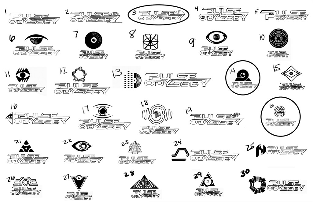
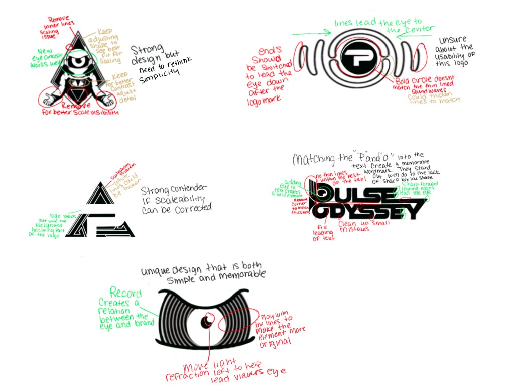
The initial phase focused on divergent thinking, rapidly sketching over 30 concept ideas that combined typography, symbolism, and abstract iconography. Central themes explored included:
- Cyclops eye symbolism (individuality and exploration)
- Record/vinyl motifs (music and movement)
- Soundwave patterns (resonance and sensory activation)
- Geometric odyssey imagery (journey and cosmic themes)
Guided by David Airey’s Logo Design Love (2015), the sketches prioritized simplicity, relevance, and versatility. Competitor research (Tomorrowland, Ultra Music Festival) from EDMProd (n.d.) emphasized that mythical, sensory-rich branding is crucial for standing out in the EDM space.
How the Ideas Were Refined:
Many sketches captured thematic symbolism. However, they often lacked simplicity. Scalability is also critical for a professional, multi-use brand symbol.
Process Exploration 2
Second Phase:
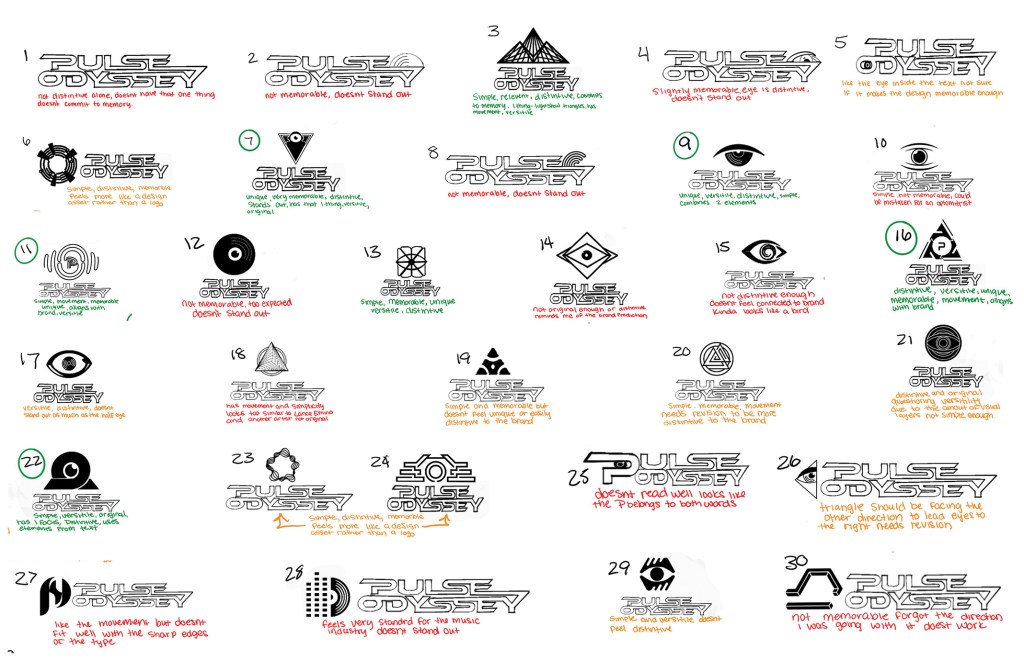
The second exploration introduced a grid-based organization of the sketches into categories:
- Symbolic Logos
- Abstract Marks
- Hybrid Systems
- Typographic Concepts
Lisa Furze’s (2019) self-critique strategy was applied, evaluating each concept for clarity, uniqueness, scalability, and emotional connection to the brand.
Strongest Concepts Identified:
Sketches #7, #9, #11, #16, and #22 emerged as the strongest contenders. They all emphasize eye symbolism, vinyl motion, and geometric structure.
How the Ideas Were Refined:
Despite improvements, some logos were still too detailed for small applications. These small applications include embroidery or mobile interfaces. This revealed the need for further simplification.
Process Exploration 3

Third Phase:
This phase involved building vectors of the strongest concepts and applying deeper strategic critiques:
- Simplified Forms: Refined line weights and shapes for clean scalability.
- Letter-Spacing and Contrast: Balanced typography for maximum legibility at all sizes.
- Hierarchy Corrections: Applied Mumaw’s (2022) flow principles to establish clear visual priority.
Critiques Addressed:
- Top-heavy designs (especially astronaut helmet icons) were rebalanced.
- Wordmark inconsistencies (notably “P” extensions in Pulse) were corrected.
- Cluttered secondary elements in Cyclops and soundwave designs were eliminated.
How the Ideas Were Refined:
The solutions sharpened line work. They improved spacing. These changes created a stronger, more dynamic visual flow. This was essential for maintaining brand energy and clarity.
Process Exploration 4

Final Phase:
The primary logo design was made on the cyclops astronaut paired with a custom Pulse Odyssey wordmark.
Key Adjustments:
Typography: Polished to convey forward momentum and futuristic energy, ensuring maximum readability at any scale.nicate Pulse Odyssey’s sensory-driven brand story.
Cyclops Astronaut: Refined to symbolize individuality, exploration, and limitless sensory journeys.
Research-Based Validation:
Simplicity and Memorability:
- David Airey (2015): Strong logos must be bold, simple, and instantly recognizable. Pulse Odyssey’s final logos achieve this through clean, powerful forms.
Symbolic Relevance:
- Cooler Insights (2012): Semiotic-rich branding (like the Cyclops) deepens audience engagement through mythological and symbolic narratives.
Audience Connection:
- ERIC (2003): EDM audiences seek visual immersion and personal identity—both captured through the eye (individuality) and astronaut (exploration) motifs.
Functional Versatility:
- Creative Bloq (2023): Good logos must adapt across merchandise, digital platforms, and events. Pulse Odyssey’s scalable vector system ensures functional flexibility without loss of brand identity.
Brand Media Assets: Stationery Package Development
Original Concept – Energetic but Unrefined Structure

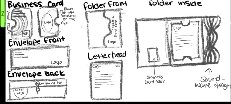

First Attempt:
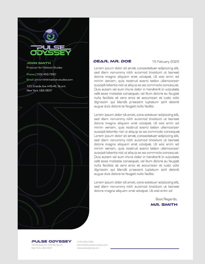
The original stationery concepts explored layouts for the business card, letterhead, envelope, and folder. Initial designs focused on large logo placements. They also used experimental soundwave patterns and geometric frames. These elements suggest motion, rhythm, and sensory energy. This aligns with Pulse Odyssey’s brand experience.
How the Ideas Were Refined:
Despite capturing brand energy, early designs faced several challenges:
- Overcrowded Layouts: Some designs suffered from inefficient use of space, making important information harder to locate and reducing overall readability.
- Logo Placement Conflicts: Overemphasized logos occasionally competed visually with critical content like addresses and contact details.
- Cohesion Gaps: Folder and envelope designs felt disconnected from the broader brand’s clean, futuristic aesthetic.
According to Irene Saltz (2024), strong stationery design must prioritize:
- Clear hierarchy.
- Consistent brand identity.
- Practical usability across print and digital platforms.
Problem Identified:
Early drafts conveyed the brand’s energetic spirit. However, they lacked the professional structural refinement. They also lacked the flow necessary for effective communication.
Final Solution – Refining the Stationery Package
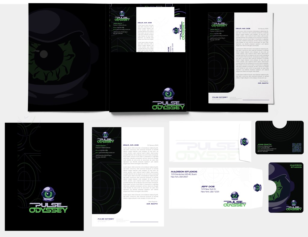
The Pulse Odyssey stationery package evolved from an energetic but structurally imbalanced concept. It has transformed into a clean, futuristic, and highly functional brand system. The final stationery suite has undergone strategic refinement. It focuses on visual hierarchy, brand cohesion, and usability. This enhancement amplifies the Pulse Odyssey experience. It also enhances professional communication touchpoints.
Refined Layouts:
- Applied clear typographic hierarchy across all pieces to create intuitive reading flow (Saltz, 2024).
- Isolated essential communication content (names, addresses, contacts) into dedicated, unobstructed zones.
Subtle Brand Reinforcement:
- Introduced light, layered pattern accents (derived from Pulse Odyssey’s brand pattern) to background elements without overpowering text.
- Used futuristic color blocking (neon green, deep purple, and black) to reinforce brand tone while avoiding visual fatigue.
Folder Redesign for Efficiency:
- Added a business card slot and structured internal document holders to the folder, improving organization and professional presentation during hand-offs.
Envelope Update:
- Transitioned to a streamlined, secure string-tie envelope design, enhancing both aesthetics and practicality for real-world usage.
Optimized for Scalability:
- Conducted print clarity and digital readability tests across all assets (business cards, PDFs, etc.) to ensure the brand maintains impact whether viewed physically or electronically.
Evidence of Success – Research-Based Validation
Visual Hierarchy:
- Irene Saltz (2024): Strong visual hierarchy improves reader attention and message clarity. Pulse Odyssey’s letterhead and business cards now guide the eye logically through brand elements and content.
Brand Consistency:
- Alina Wheeler (2017): Consistent brand visuals across touchpoints build audience trust and memorability. The refined stationery package extends Pulse Odyssey’s immersive aesthetic while maintaining professional restraint across all collateral.
Usability and Functionality:
- Saltz (2024): Modern branding demands flexible, real-world-ready designs, especially for event-driven brands. Pulse Odyssey’s folder and envelope upgrades ensure professionalism during interactions with clients, sponsors, and partners.
Brand Media Assets: Logo Animation Development
Original Concept – Early Energy Without Full Storytelling

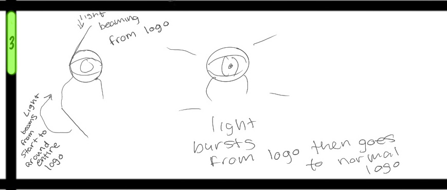
First Attempt:
Early animation sketches mapped out a neon light trail. It swirls into the Pulse Odyssey Cyclops logo. This culminates in a light flare burst from the eye center.
The storyboards explored:
- Motion through circular arcs and dynamic glowing effects.
- Color transitions meant to reinforce the brand’s high-energy EDM aesthetic.
How the Ideas Were Refined:
Although early drafts captured energy, several key challenges emerged:
- Motion-Identity Disconnect: The movement lacked cohesion with the brand’s emotional narrative.
- Timing and Pacing Issues: Early sequences did not fully simulate EDM rhythm patterns of build-up, drop, and pulse.
- Missing Sound and Wordmark Integration: Without audio cues or seamless brand name transitions, emotional engagement remained limited.
According to Hooks (2018), effective motion design must enhance emotional connection, not merely animate logos. Similarly, Das (2023) emphasizes that motion graphics should advance brand storytelling, moving beyond visual effects into emotional brand activation.
Problem Identified:
While visually dynamic, early versions needed tighter storytelling. They required brand color alignment. Sensory (sound) integration was necessary to truly represent Pulse Odyssey’s journey.
Final Solution – Refining the Animation
The team refined Pulse Odyssey’s logo animation into a cohesive, emotionally charged brand journey.The final animation has undergone strategic refinement of motion flow and brand color usage. It integrates storytelling and aligns pacing with EDM culture. Now, it immerses audiences immediately into the Pulse Odyssey experience. It prepares them for the sensory journey the brand delivers.
Neon Light Trail Refinement:
- A swirling neon light trail now guides the eye, symbolizing rhythmic energy and forward momentum, key aspects of EDM culture.
Central Light Flare Burst:
- At the center of the Cyclops eye, a light burst explodes outward. This represents the “awakening” of the sensory journey that Pulse Odyssey delivers.
Wordmark Transition:
- The light flare naturally transitions into revealing the Pulse Odyssey wordmark, ensuring brand identity clarity and emotional storytelling continuity.
Color and Brand Alignment:
- Color trails and flare effects were corrected to match Pulse Odyssey’s neon green and electric purple palette. This ensures a consistent brand presence across digital, print, and merchandise platforms.
Motion Pacing Optimization:
- The animation’s pacing was refined to mimic an EDM track:
- Slow, hypnotic build-up with light trails.
- Fast crescendo and burst with flare and logo reveal.
Sound Integration (Next Phase):
- Final feedback led to the development of plans. These plans include adding a low bass “pulse” and sweeping light sounds during the light trail movement. This addition reinforces the sensory immersion.
Research-Based Validation
Higher Engagement:
- VistaCreate (n.d.) and Grgurović (2024):
Motion graphics outperform static images in engagement and viewer retention, particularly across social media and event screens.
Emotional Resonance:
- Hooks (2018): Thoughtful movement builds emotional attachment to brands. Pulse Odyssey’s animation, through light motion and pacing, strengthens the audience’s emotional connection.
Stronger Storytelling:
- Das (2023): Motion graphics accelerate emotional storytelling and enhance memory retention.
Pulse Odyssey’s dynamic journey from swirling trail to wordmark delivers immediate narrative impact.
Immersive Experience:
- Designity (2023): Motion branding creates multi-sensory immersion, crucial for experiential brands. Pulse Odyssey’s animation complements its promise of full sensory stimulation and emotional engagement.
Brand Media Assets: Social Media Assets
Original Concept – Energetic Visuals but Weak Brand Visibility

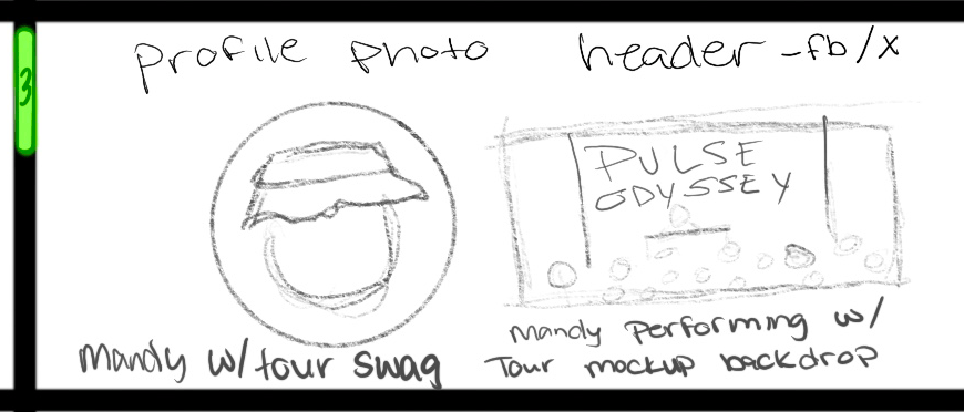
First Attempt:
Early concept sketches for the Pulse Odyssey social media package included:
- Profile photo designs for Facebook (Meta), X (formerly Twitter), and Instagram.
- Header image layouts featuring Mandy Madison DJing, crowd energy shots, and Pulse Odyssey brand overlays.
The goal was to create a personal connection through Mandy. It was also to maintain consistent brand visibility using the Pulse Odyssey logo and core colors.
How the Ideas Were Refined:
While the early sketches captured high energy and excitement, key issues were identified:
- Overemphasis on Environment: Concert backdrops and crowd scenes sometimes overwhelmed the branding elements.
- Profile Readability Issues: At small sizes (especially on mobile-first platforms like Instagram), the logo or branding elements lose clarity.
- Lack of Simplicity: Some headers were too complex for instant recognition, reducing the brand’s quick visual impact.
According to Saltz (2024), social media branding must prioritize clarity, scalability, and consistent visual identity to maximize engagement across devices.
Problem Identified:
The initial designs conveyed energy but lacked brand-first visibility and mobile optimization necessary for modern digital audiences.
Final Solution – Refining the Social Media Package
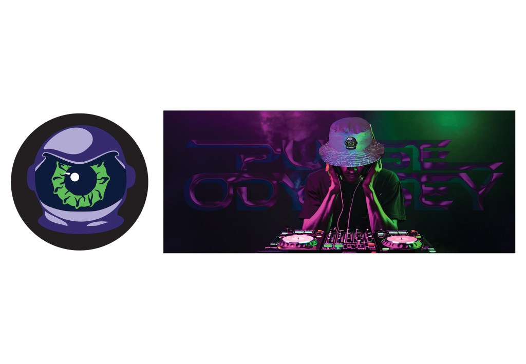

Pulse Odyssey’s social media package evolved from environment-heavy, brand-diluted sketches into a focused, highly recognizable, and emotionally engaging system. The final assets underwent strategic refinement of logo prominence. They also refined composition hierarchy and scalability testing. Furthermore, they aligned with the full brand system. As a result, they now deliver instant brand recognition and immersive sensory energy across major digital platforms.
Profile Image Refinement:
- Updated the profile image to feature the Cyclops astronaut logo, isolated against a dark, simple background.
- Ensured the icon remained instantly recognizable even at small, thumbnail sizes.
Header Image Refinement:
- Designed cleaner headers by combining:
- Live energy (crowd/stage scene backgrounds)
- Prominent Pulse Odyssey logo overlays centrally or heroically placed.
- Incorporated purple and green lighting effects to maintain the brand color palette and reinforce emotional resonance.
Hierarchy and Layout Adjustments:
- Positioned the logo as the primary focal point in all header compositions.
- Balanced color contrast and lighting to ensure readability even after platform compression on Facebook and X.
Scalability Testing:
- Previewed designs across multiple screen sizes and device types (mobile, tablet, desktop) to verify clarity and impact at every breakpoint.
Alignment with Full Brand System:
- Carried over Pulse Odyssey’s full branding elements:
- Typography styles
- Iconography treatments
- Neon light effects
- Ensured seamless visual consistency across social media and all brand touchpoints.
Research-Based Validation
Brand Visibility:
- Saltz (2024): Immediate brand recognition at small sizes is critical for social media branding.
Pulse Odyssey’s Cyclops-centered profile images achieve fast, mobile-optimized brand recall.
Emotional Resonance:
- Grgurović (2024) and VistaCreate (n.d.): Motion visuals and energy-centric imagery drive higher engagement. Pulse Odyssey’s vibrant headers showcase crowd immersion while maintaining brand dominance.
Platform Adaptability:
- Designity (2023): Scalable, flexible social assets increase retention and click-through rates.
Pulse Odyssey’s social media assets were tested for scalability and readability at all screen sizes.
Brand Media Assets: Merchandise (Swag) Package Development
Original Concept – Exciting Designs but Disconnected Brand Unity


Problem Identified:
Some early swag designs looked strong individually. However, they failed to reinforce a unified, emotionally resonant brand experience across the full merchandise line.
First Attempt:
Early sketches proposed three key merchandise items:
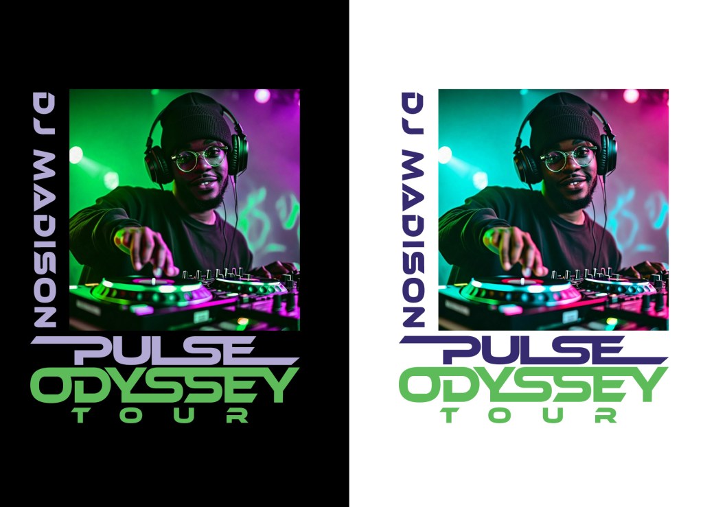
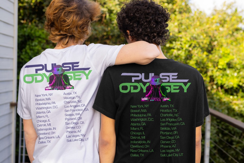
- T-Shirts (front and back designs featuring the brand mascot, tour dates, and wordmark)
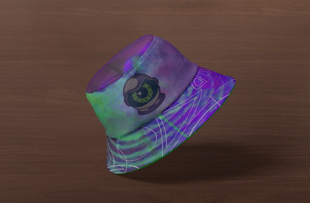
- Bucket Hats incorporating the brand pattern and logo
- Water Bottles with cosmic-themed patterns and logo integration
The goal was to create wearable, collectible, and immersive merchandise consistent with EDM concert culture and Pulse Odyssey’s brand identity.
How the Ideas Were Refined:
While the initial concepts were visually exciting, several issues were identified:
- T-shirt Front Design Weakness: The early front design was too generic. It lacked a strong emotional tie to the brand’s sensory storytelling.
- Overreliance on Space Textures: Some swag items leaned heavily on cosmic designs without prioritizing Cyclops mascot visibility or wordmark prominence.
- Color and Contrast Challenges: Color choices needed refinement to ensure impactful visibility across various materials (cotton, plastic, synthetic fabrics).
Research from Royer Communications (2023) emphasized that merchandise must adapt to different media while preserving a cohesive brand story.
Final Solution – Refining the Merchandise Package
T-shirt Front Redesign:
- Featured a heroic, neon-lit photo of Mandy Madison DJing, overlaid with the Pulse Odyssey wordmark and tour subtitle.
- Captured the brand’s sensory energy and emotional resonance through vibrant, high-contrast visuals.
T-shirt Back Finalization:
- Designed the back to prominently feature another piece of merchandise with the Pulse Odyssey logo. It includes a full listing of tour dates and cities. This design enhances the item’s collectibility and event connection.
Bucket Hat Finalization:
- Integrated cosmic fabric prints with subtle use of the Pulse Odyssey pattern and Cyclops mascot logo.
- Balanced vibrant colors with a wearable, fashion-forward layout, ensuring visibility without overwhelming the design.
Water Bottle Design:
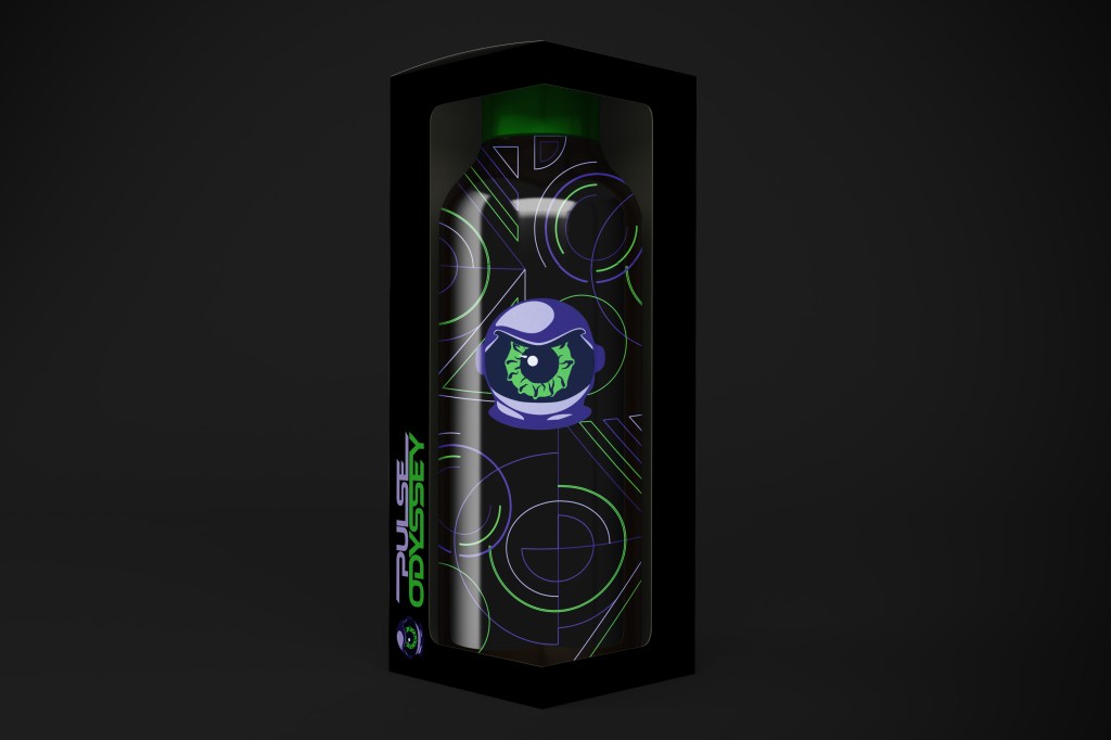
- Wrapped the Pulse Odyssey brand pattern around the bottle, centering the Cyclops logo prominently.
- Designed packaging with a transparent window to showcase the branding before opening, enhancing merchandising impact.
Material and Printing Adjustments:
- Fine-tuned holographic textures and neon gradients for accurate color reproduction across different materials (following Royer Communications, 2023 recommendations).
- Ensured color vividness and detail retention across cotton apparel, synthetic hats, and plastic drinkware.
Merch Cohesion Testing:
- Reviewed all final merchandise items together to confirm they delivered consistent brand energy. They ensured a unified visual identity. The goal was immediate emotional recognition when seen as a collective.
Research-Based Validation
Wearability and Identity:
- Royer Communications (2023): Brand merchandise should be both expressive and wearable.
Pulse Odyssey’s stylish integration of logos, textures, and themes achieves this dual goal.
Brand Unity:
- Saltz (2024): Merchandise must consistently extend the brand’s voice and story. Every swag item—from T-shirts to bucket hats to water bottles reinforces the Pulse Odyssey sensory journey.
Audience Connection:
- EDM culture emphasizes collectible tour items as badges of belonging. Pulse Odyssey’s merchandise taps into this, deepening the audience’s emotional connection and extending the event’s impact beyond the concert itself.
The merchandise package of Pulse Odyssey evolved from sketches that were visually interesting but disconnected from the brand. It transformed into a cohesive collection. This collection is emotionally resonant and consists of wearable and functional art. The final swag line has undergone strategic design refinement. It includes material-specific printing adjustments and full-brand cohesion testing. Now, it extends the Pulse Odyssey sensory experience into fans’ everyday lives. This reinforces brand loyalty and cultural connection.
Brand Media Assets: Ticket Package Development
Original Concept – Functional but Lacking Emotional Brand Impact

Problem Identified:
Early ticket and badge designs fulfilled functional needs. However, they needed stronger emotional branding. They also required visual cohesion and enhanced user experience across all items.
First Attempt:
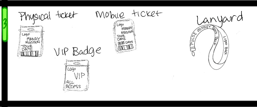
Initial sketches for the Pulse Odyssey ticketing system included:
- Physical event tickets
- Mobile tickets
- VIP badges
- Lanyards
The designs explored space-themed graphics, Pulse Odyssey branding integration, and formats optimized for both print and digital user experiences. The overall goal was to balance event functionality with immersive brand storytelling, making every piece feel collectible.
How the Ideas Were Refined:
Although the early sketches handled basic functionality, several challenges emerged:
- Limited Emotional Engagement: Ticket designs emphasized information delivery but lacked strong visual storytelling tied to Pulse Odyssey’s sensory brand identity.
- VIP Badge Exclusivity Gaps: Early badges missed opportunities to make the holder feel elevated and distinguished.
- Underdeveloped Lanyard Design: Initial lanyards were too minimal and did not fully express the brand’s futuristic aesthetic.
According to MeetingsNet (2023), successful event experiences require ticketing systems that seamlessly integrate brand identity, functionality, and emotional engagement.
Final Solution – Refining the Ticket Package
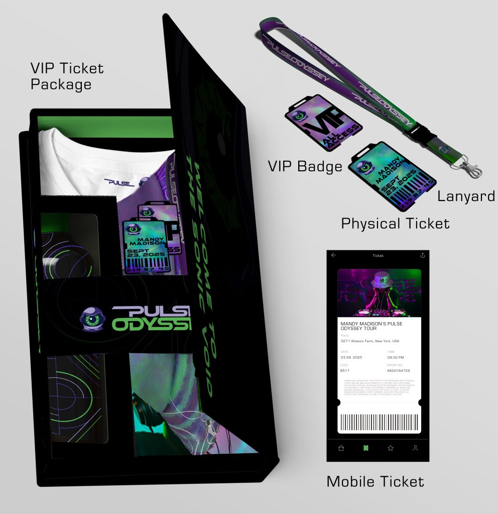

Pulse Odyssey’s ticket package evolved from functional early drafts into a dynamic, emotionally resonant, fully branded audience journey. The final ticket system now elevates audience excitement through strategic refinement of visual cohesion. It also uses emotional storytelling and multi-platform coordination. This excitement begins the moment recipients receive their ticket and continues to their arrival at the event. This fully aligns with the brand’s promise of a once-in-a-lifetime sensory experience.
Physical and Digital Ticket Refinement:
- Both physical and mobile tickets now showcase the Pulse Odyssey visual system:
- Vibrant neon green and purple gradients
- Cyberpunk-style typography
- Heroic DJ visuals are blended with essential concert information.
- Integrated barcode scanning on both formats for efficient, frictionless check-in.
VIP Badge Enhancement:
- Redesigned VIP badges feature:
- Bold, futuristic “ALL ACCESS” typography
- Holographic backgrounds to create a sense of exclusivity and sensory richness.
Lanyard Redesign:
- Introduced neon gradient lanyards with repeating Pulse Odyssey wordmarks, ensuring a premium, stylish feel while reinforcing brand recognition.
Package Cohesion:
- Assembled all items into a unified VIP package, using custom packaging that extended brand patterns and messaging:
- Included phrasing like “Welcome to the Sonic Void” to create an immersive first impression.
Website and Navigation Coordination:
- Ticket information and access were seamlessly aligned with the Pulse Odyssey website. This alignment reinforced the high-energy, futuristic brand experience. It also made ticket downloads and event updates intuitive.
Research-Based Validation
Seamless Experience:
- MeetingsNet (2023): Modern event branding must connect physical and digital touchpoints for a cohesive experience. Pulse Odyssey’s physical and mobile tickets are fully aligned under a unified brand system.
Emotional Resonance:
- Royer Communications (2023): High-impact event branding must extend from physical design to the customer journey. Pulse Odyssey’s ticketing elements transform the entry process into an immersive brand encounter.
Event Branding Impact:
- Saltz (2024): Every small brand touchpoint, including badges and lanyards, reinforces brand loyalty and audience recall. Pulse Odyssey’s VIP packages and event credentials deepen brand attachment at every step.
Brand Media Assets: Website Development
Initial Concept – Solid Navigation, Limited Brand Immersion


First Attempt:
Initial website sketches proposed:
- A homepage, artist bio page, and ticket purchase page.
- Emphasis on core navigation points: Home, Meet Mandy, Tickets, and Social Media Links.
How the Ideas Were Refined:
While the early layouts provided a logical structure, user testing and deeper brand alignment revealed the need for:
- Stronger brand immersion through visuals and motion.
- Higher emotional engagement that fits Pulse Odyssey’s futuristic, sensory-driven identity.
Research from Das (2023) and VistaCreate (n.d.) emphasized that for EDM audiences, digital experiences must be dynamic, emotionally charged, and visually captivating.
Problem Identified:
Early designs were functionally sound but lacked the dynamic, sensory storytelling necessary to match Pulse Odyssey’s brand promise.
Final Solution – Refining the Website
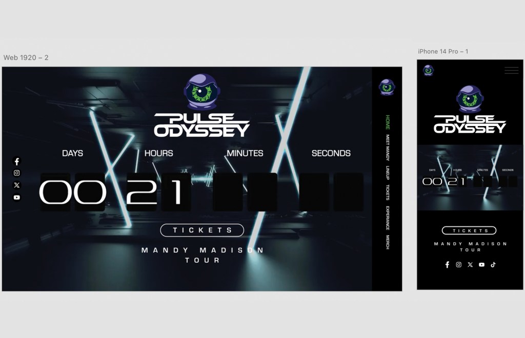

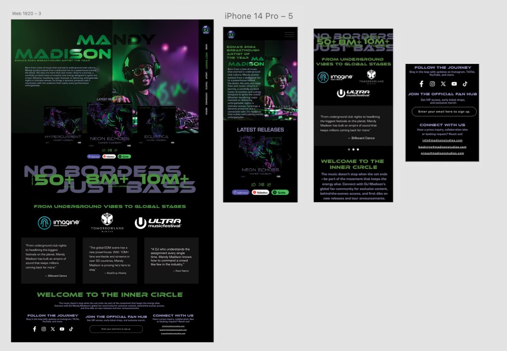
Home Page
Initial Sketch: Logo, hero image, and basic navigation links.
Final Design:
- Full-screen countdown timer creating urgency and energy leading to event kickoff.
- Hero image of DJ Mandy Madison layered dynamically under the logo.
- Floating social media links for continuous cross-platform engagement.
- Strong CTA (“Tickets”) immediately visible without scrolling.
- On-scroll logo interaction: Logo shrinks into a corner, maintaining brand presence while opening space for visuals.
Impact: The full-screen countdown and dynamic visuals establish immediate sensory immersion aligned with Pulse Odyssey’s high-energy brand messaging (Hooks, 2018).
Tickets Page
Initial Sketch: Basic options for different ticket types.
Final Design:
- Three clear ticket tiers: General Admission, Early Access, and VIP.
- Futuristic typography and bold neon green/white color palette for clarity and cohesion.
- Animations and hover interactions enhancing energy and usability.
- Collapsible FAQ sections and bold CTA buttons to simplify the ticket purchase flow.
Impact: The new design drives fast decision-making while reinforcing the brand’s energetic identity at every interaction.
Meet Mandy Page (Artist Bio Page)
Initial Sketch: Background image with text description.
Final Design:
- Split layout featuring text bio alongside a full-height portrait with neon overlays.
- Carousel feature showcasing Mandy Madison’s latest releases (Hypercurrent, Neon Echoes, Ecliptica).
- Social proof integration: Logos from major EDM festivals (Tomorrowland, Ultra Music Festival) for credibility.
- Embedded statistics:
- 50+ countries played
- 8M+ monthly listeners
- 10M+ followers
Impact: Creates a strong emotional connection between the artist and audience while validating Mandy Madison’s authority in EDM culture.
Responsive Mobile Design
Initial Sketch: General stacked mobile layout.
Final Mobile Execution:
- Mobile-optimized countdown timer.
- Burger menu with a clean, minimalist active highlight state.
- Clean stacking of image galleries and ticket options.
- Thumb-friendly interactive elements preserving brand visuals at smaller sizes.
Impact: Research from Grgurović (2024) and TargetVideo confirms that mobile-first, dynamic websites dramatically improve user retention, critical for reaching Pulse Odyssey’s young EDM audience.
Animation and Motion Design
Initial Plan: Basic motion accents.
Final Execution:
- Light flare transitions between sections.
- Pulsing animations synchronized with EDM rhythms.
- Smooth scroll animations enhance navigation.
- Neon accents dynamically highlight navigation elements.
Impact: Following Hooks (2018) and Designity (2023), these motion elements create deeper emotional engagement and significantly increase brand memorability.
Testing and Adjustments
Feedback Adjustments from Testing Submissions:
- Smoothed mobile menu flows for intuitive user interaction.
- Improved text readability against neon-heavy backgrounds.
- Optimized button states for hover, click, and tap responsiveness.
- Rebalanced imagery and text overlays to maintain clarity and prevent visual competition.
These refinements ensured both usability and immersive brand consistency throughout the digital experience.
Research-Based Validation
Dynamic Engagement:
- Das (2023): Motion graphics and embedded interaction boost emotional resonance and user engagement.
Emotional Resonance:
- Hooks (2018): Movement and sensory integration strengthen brand memory and connection.
Mobile-First Optimization:
- Grgurović (2024) and VistaCreate (n.d.): Mobile-optimized experiences improve retention and engagement, especially with younger audiences.
Seamless Motion Design:
- Designity (2023): Motion elements aligned with brand storytelling deepen immersion, matching Pulse Odyssey’s sensory brand promise.
Pulse Odyssey’s website development evolved from a functional navigation structure into a fully immersive, emotionally charged, motion-driven digital experience. Through bold visual redesign, we achieved a strategic motion integration. With mobile optimization and emotional storytelling, the final site now fully reflects Pulse Odyssey’s futuristic, sensory-driven brand identity. It captivates users from first click to final conversion.
References
Airey, D. (2015). Logo Design Love: A guide to creating iconic brand identities (2nd ed.). New Riders. https://learning.oreilly.com/library/view/logo-design-love/9780133812589/
Cooler Insights. (2012, May 21). The role of semiotics in marketing. Retrieved January 27, 2025, from https://coolerinsights.com/2012/05/the-role-of-semiotics-in-marketing/
Creative Bloq. (2023, August 15). How to craft a powerful logo shape. Retrieved January 27, 2025, from https://www.creativebloq.com/logo-design/psychology-logo-shapes-8133918
Das, S. (2023). The impact of motion graphics in modern branding and marketing. Journal of Digital Media, 12(3), 45–58.
Designity. (2023). Motion graphics for social media: A how-to guide. Retrieved from https://www.designity.com/blog/motion-graphics-for-social-media-a-how-to-guide
DesignMantic. (2021, April 19). The role of line in graphic design. DesignMantic. https://www.designmantic.com/blog/line-in-graphic-design/
EDMProd. (n.d.). Artist branding: How to build a strong music brand. Retrieved from https://www.edmprod.com/artist-branding/
ERIC. (2003). Fractals and chaos theory in sound design: Exploring nonlinearities and pattern creation in EDM(Report No. EJ717806). ERIC. https://files.eric.ed.gov/fulltext/EJ717806.pdf
Furze, L. (2019). Self-critiquing your biz designs. Retrieved from https://lisafurze.com/blog/self-critiquing-your-biz-designs/
Grgurović, M. (2024, May 10). Video ads vs. image ads: What should publishers choose? TargetVideo. Retrieved from https://target-video.com/video-vs-image-ads/
Hooks, R. (2018, December 11). The illusion of movement in graphic design. 99designs. https://99designs.com/blog/tips/movement-in-graphic-design/
MeetingsNet. (2023, July 10). How tech is transforming the ticketing experience. Retrieved from https://www.meetingsnet.com/event-tech/tech-transforming-ticketing-experience
Royer Communications. (2023). Designing for different print materials: Creating a cohesive brand. Royer Communications. Retrieved from https://royercomm.com/designing-for-different-print-materials-creating-a-cohesive-brand
Saltz, I. (2024). Learning graphic design: Things every designer should know. LinkedIn Learning. https://www.linkedin.com/learning/learning-graphic-design-things-every-designer-should-know/unblock-it?u=50813145
The Logo Company. (n.d.). The psychology of color in logo design. Retrieved January 27, 2025, from https://thelogocompany.net/psychology-of-color-in-logo-design/
VistaCreate. (n.d.). How to use motion graphics for social media and ads. Retrieved from https://create.vista.com/blog/using-motion-graphics-for-social-media-and-ads/

