
Collaboration
This Page presents a comprehensive collection. it includes instructor, peer and self-Assessment feedback gathered throughout the development of the pulse odyssey brand. readers can expect to find Reflections on key design decisions. there are also insights to the creative process, from Early concept Exploration to final refinements. the feedback highlights strengths in brand Identity, voice, and visual cohesion.
Design Strategies and Motivation – Instructor Feedback from Bartley Argo
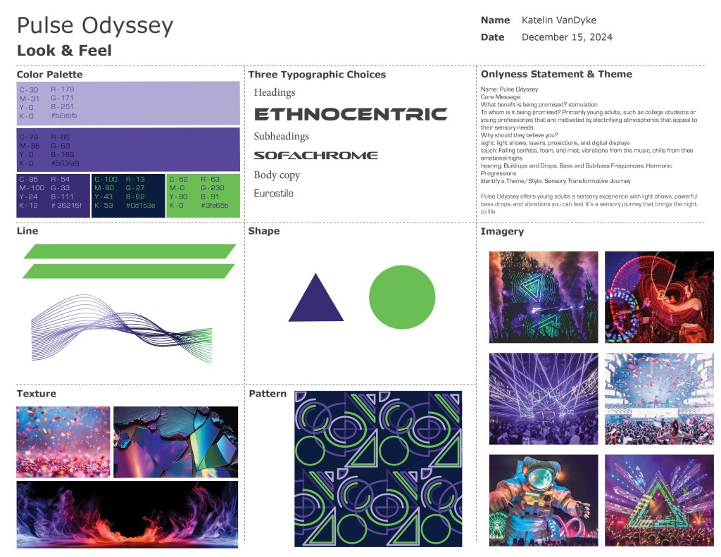
The feedback centered on the brand’s look and feel, highlighting its strengths and opportunities for refinement. The aesthetic was visually striking. It was tonally aligned with the Pulse Odyssey concept. This effectively captured a bold, immersive atmosphere that supports the brand’s identity (Das, 2023). Yet, a clear suggestion was made to push the visuals further by refining how certain elements worked together to create a more intentional and cohesive system (VistaCreate, n.d.).
One point of feedback focused on the relationship between different textures, colors, and imagery. It advised more control over how those pieces interact across applications. The energy was effective. Some areas risked feeling overwhelming. Others were slightly disjointed, depending on their layering or composition (Relentless Beats, 2022). The recommendation was to balance intensity with clarity. This helps avoid visual fatigue. It also ensures the brand remains accessible to a wider audience (Brownlee, 2021).
This feedback helped guide a more critical eye during refinement. It reinforced that a strong brand look isn’t just about being visually exciting. It’s about delivering that excitement in a way that feels curated. The experience must be consistent and intentional (Frascara, 2004). Adjustments were made to better unify the visual language and ensure that every detail contributed to a polished, immersive experience.
Design Strategies and Motivation – Instructor Feedback from Bartley Argo

This feedback focused on the Pulse Odyssey vision board, offering encouragement alongside constructive critique. The overall mood and emotional tone were recognized as distinct and engaging (Relentless Beats, 2022). However, the instructor noted that the board would benefit from stronger clarity and more focused curation. While the intention behind the selections was evident, some imagery and elements felt visually dense or overly broad, making it harder to quickly grasp the brand’s core message (VistaCreate, n.d.).
There was also a suggestion to think more critically about how each image contributes to the larger narrative. This ensures each visual fits aesthetically. It reinforces the themes of energy, immersion, and individuality that Pulse Odyssey is built on (Das, 2023). The feedback emphasized that a vision board isn’t just a collage. It serves as a strategic communication tool. It is designed to establish tone, direction, and creative intent with immediate impact (Frascara, 2004).
This feedback led to a more refined approach in later phases. Adjustments were made to narrow the visual focus, eliminating anything that felt redundant or off-brand. These changes strengthened the connection between the vision board and the resulting brand identity system. The critique ultimately helped sharpen the visual foundation. It ensured the mood and energy of Pulse Odyssey came through more clearly. The intention was more purposeful.
Design Integration – Instructor Feedback from Adam Baldowski with peer feedback
The feedback segment centered around the initial logo exploration phase. During this stage, thirty variations were created as part of the iterative design process. Commentary from both instructor and peers highlighted the strength of the exploratory work. They praised the strategic thinking behind generating a broad range of options (Brownlee, 2021). This approach was considered crucial. It aided in finding the visual language. This language best conveyed the brand’s core values of individuality, immersion, and energy (Das, 2023).
The evolution of the logo was recognized, from early conceptual sketches to more refined, symbol-driven solutions. Narrowing down the thirty variations allowed for deeper refinement and greater intentionality. The feedback emphasized the importance of pushing beyond the first few ideas. It noted that genuine breakthroughs often emerge through continued iteration and testing (Frascara, 2004). The final logo direction felt earned. It emerged from a thoughtful process of experimentation and analysis. It did not result from default choices.
This moment underscored the value of range and resilience in identity design. By starting wide, the process explored a variety of directions early on. This strategy allowed the strongest elements to rise to the surface, ultimately shaping a logo that carried meaning, memorability, and flexibility within the Pulse Odyssey system (VistaCreate, n.d.).
Design Integration – Instructor Feedback from Adam Baldowski
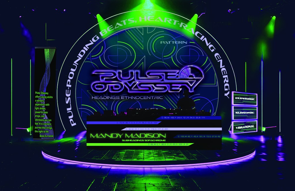
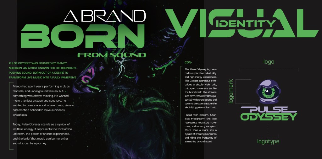
The feedback for the brand’s logo design highlighted its strong alignment with the overall concept, emphasizing that the logo visually captured the essence of Pulse Odyssey and remained consistent with the original vision board (VistaCreate, n.d.). The design was recognized for its ability to combine symbolism with simplicity. The Cyclops astronaut effectively conveyed the theme of individuality. It also highlighted exploration and energy. These ideas were delivered without unnecessary complexity (Das, 2023).
A key insight centered on the logo’s balance of meaning and visual presence. Its adaptability across various formats demonstrated a solid understanding of scalability and brand consistency (Brownlee, 2021). Additionally, the instructor emphasized that the logo was more than a graphic. It served as a visual anchor within the broader brand system (Frascara, 2004).
This feedback validated the creative direction. It confirmed that the logo served as a compelling gateway into the Pulse Odyssey universe. It highlighted the importance of ongoing refinement to enhance clarity. It also emphasized versatility while preserving the symbolic weight. The symbolic weight defines and distinguishes the brand.
Multi-Platform Delivery – Instructor Feedback from Andrea Kratz
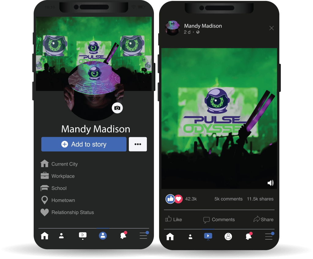
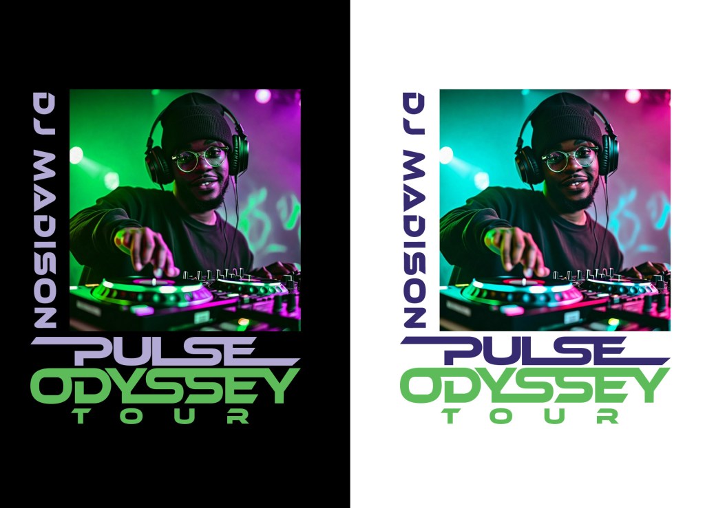
The instructor’s feedback emphasized both the visual strength and strategic clarity of the Pulse Odyssey brand identity. The overall design was described as “visually stunning” and “professional-level,” validating the brand’s immersive aesthetic and design quality (VistaCreate, n.d.). An important insight discussed the challenges of using a real person. For example, consider Mandy Madison as a brand element. This is especially true in contexts where graphics must scale down for mobile or social media profile images.
The critique highlighted the need to simplify the figure so it remains recognizable at small sizes. Suggestions included focusing on a head-shot. It was also suggested to apply stylization techniques such as graphic reduction, vector treatment, or posterization (Brownlee, 2021). The goal was to preserve clarity and visual impact across digital platforms. It reinforced the importance of testing branding elements not only at full scale but also in microformats (Frascara, 2004).
Initially, this feedback was not fully embraced. The assumption was that most users were deeply familiar with social media. It was believed they would recognize faces even at thumbnail sizes. This perspective overlooked the reality. Not all users engage with social media in the same way. This is especially true for those outside the digital-native demographic. The brand’s broader audience includes individuals less familiar with these visual norms. Simplification and legibility are more essential (Das, 2023). This realization prompted future refinements to improve visual consistency and ensure accessibility across all applications and user groups.
Multi-Platform Delivery – Instructor Feedback from Andrea Kratz
The instructor’s feedback offered key production-focused insights that directly shaped the refinements moving forward. A central recommendation was to reconsider the brand’s sound effect, ensuring it felt integrated and intentional. It needed to align tonally with the immersive, high-energy world of Pulse Odyssey (Das, 2023). This feedback reinforced the understanding that sound is not merely an add-on. It is a vital layer of brand storytelling. Sound must support the visual tone and emotional resonance of the experience (Relentless Beats, 2022).
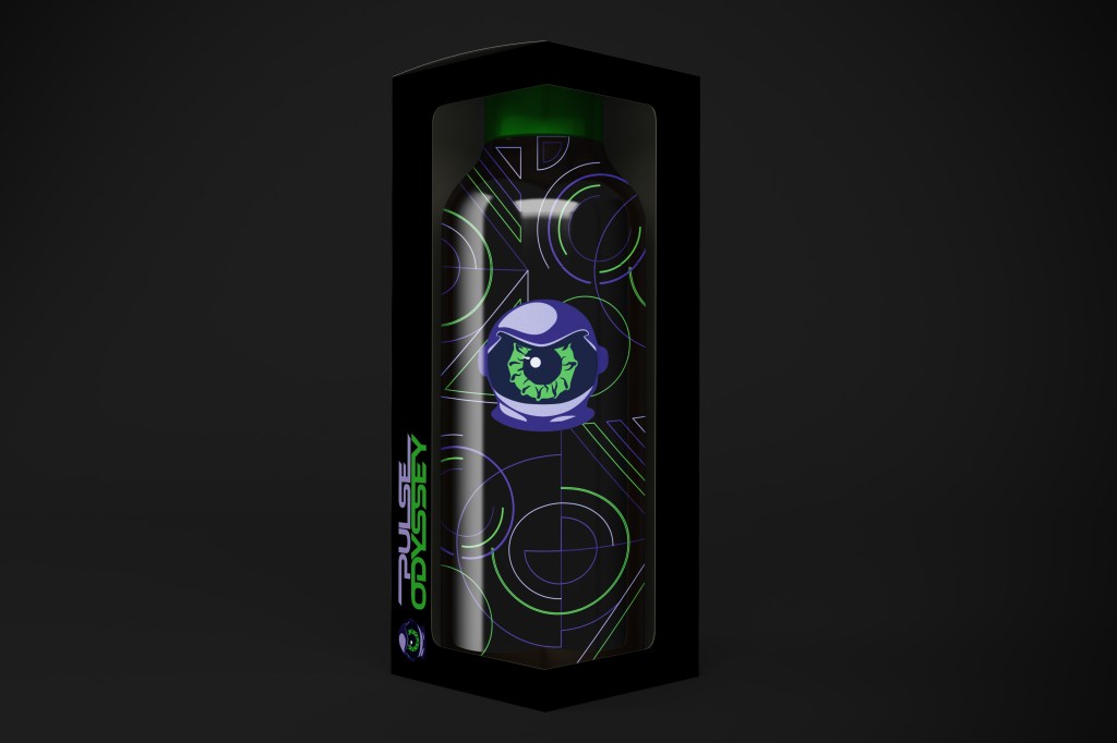
Another significant technical adjustment involved converting the visual output from RGB to CMYK color space. This shift was critical for the accuracy and vibrancy of print-based assets. Implementing this change early in the production process helped ensure that the visuals remained consistent and impactful across physical formats, including posters, merchandise, and packaging (VistaCreate, n.d.). Recognizing that digital palettes can shift unpredictably in print underscored the need for production aware design decisions.
This feedback proved instrumental in elevating the professional quality of the final assets. The refinements to sonic branding and color output strengthened the alignment between the brand’s conceptual vision and its real-world execution. This ensured that Pulse Odyssey delivers a cohesive, immersive experience across all platforms.
Multi-Platform Delivery – Instructor Feedback from Andrea Kratz

The instructor provided specific technical feedback regarding image compression. It impacts brand presentation, particularly in small-scale applications like profile pictures. The caution was clear. High-resolution images can lose clarity and recognition when compressed for mobile or web platforms. This issue occurs especially when featuring a person’s face or detailed visual elements (Brownlee, 2021). This insight emphasized the importance of anticipating platform constraints during the design process.
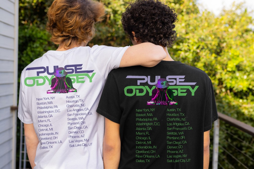
In response, the team shifted strategy by replacing the artist’s photo with the brand’s logomark. The photo risked losing visual impact due to compression. The simplified Cyclops astronaut icon delivered stronger legibility. It also ensured consistency and recognizability across screen sizes and resolutions (Das, 2023). This adaptation aligned with best practices for responsive branding and helped reinforce brand identity through a scalable, distinct visual asset (VistaCreate, n.d.).
The instructor’s note served as a valuable reminder that technical limitations, often overlooked can significantly affect user experience. Addressing them early ensured that the final result maintained clarity. It also ensured cohesion across platforms. This ultimately strengthened Pulse Odyssey’s visual presence and accessibility.
Multi-Platform Delivery – Instructor Feedback from Andrea Kratz with peer feedback


The feedback from the instructor highlighted the strength of the Pulse Odyssey brand identity in concept. Peers also acknowledged its strength in execution. The instructor emphasized how effectively the branding conveyed an immersive, high-energy experience, noting that the system did not rely solely on standalone visuals but worked cohesively across formats to support a strong, unified identity (VistaCreate, n.d.). This reinforced the importance of consistency in voice, visuals, and storytelling as the brand moved toward finalization. It also reminded us that refinement is an ongoing part of the creative process. Iteration plays a key role in shaping a resolved, professional brand system (Frascara, 2004).
Peer feedback echoed this positive assessment, particularly highlighting the bold color choices, strong visual hierarchy, and memorable aesthetic. These elements clearly connected back to the original vision board and brand intention (Das, 2023). Comments reflected genuine excitement. They suggested that the brand left a lasting impression. The brand effectively captured the intended emotional tone and vibe (Relentless Beats, 2022).
This collective feedback confirmed that the foundation of Pulse Odyssey was both strategically sound and creatively compelling. It validated the direction and set the stage for confident refinement and development across all media assets.
Measuring Design Effectiveness – Self Evaluation

The assessment was conducted to evaluate the effectiveness of the Pulse Odyssey brand playbook across all required categories. It ensured alignment with the standards and expectations outlined in the Brand Playbook Guide. As the project progressed, the creative direction was confirmed to be bold and immersive. Some elements required a more critical evaluation, particularly regarding hierarchy, visual clarity, and refinement of execution (VistaCreate, n.d.). Design aspects such as texture, legibility, and content organization prompted closer inspection. Stylistic choices contributed to the brand’s expressiveness. However, they occasionally hindered usability. They also hindered practical communication (Frascara, 2004).
The review process involved evaluating each playbook category against the provided rubric and sample references. Visual hierarchy principles were applied to analyze user navigation through the layout. Brand cohesion was reviewed to ensure tone and visuals remained consistent throughout (Brownlee, 2021). Elements, including color usage, typography, texture, and spacing, were examined to determine their impact on clarity and experience. Mechanical aspects—such as margin alignment, column widths, and image quality—were also reviewed. The goal was to ensure the playbook met professional standards. It also needed to deliver the intended immersive identity (Das, 2023).
Legibility concerns surfaced in several areas, especially due to insufficient contrast between text and background. In response, adjustments were made to text color, weight, and placement to improve readability and establish a clearer hierarchy. Overlay text on imagery was problematic in small formats. This prompted refinements such as tighter photo cropping. Text was also Text was also repositioned onto backgrounds or overlays to preserve clarity. onto backgrounds or overlays to preserve clarity.
Measuring Design Effectiveness – Peer Evaluation


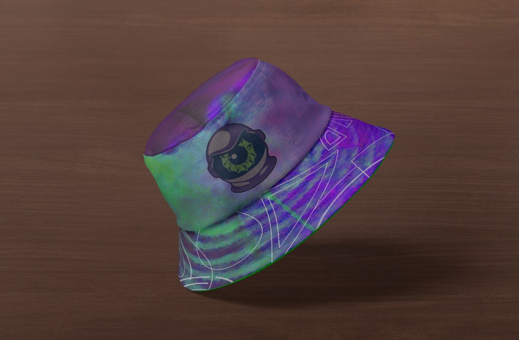
Peer feedback reflected a strong alignment with the brand’s tone, visual direction, and overall execution. The Pulse Odyssey identity was described as cohesive and immersive, with clear connections to the original vision board. The color palette, futuristic typography, and aesthetic were recognized for their consistency and effectiveness across the brand guide (Das, 2023; VistaCreate, n.d.). These elements contributed to a unified brand experience that resonated with the intended energy and tone.
The primary area for improvement involved the organization of page content. A peer recommended moving the color palette closer to the logo variations to improve clarity and ease of navigation. This suggestion emphasized the importance of narrative flow and the role layout plays in guiding user comprehension (Frascara, 2004). Enhancing the logical sequence of content supports a more intuitive reading experience, particularly in brand documentation.
Overall, the feedback confirmed that the brand system was not only visually compelling but also conceptually strong. The actionable suggestion regarding layout provided a practical refinement. This refinement would further elevate the structure and usability of the brand playbook (Brownlee, 2021).
References
Brownlee, J. (2021). How to design a brand identity. 99designs. https://99designs.com/blog/logo-branding/how-to-design-a-brand/
Das, S. (2023). Designing EDM experiences: From visual energy to brand strategy. EDMDesign Journal, 12(1), 45–58.
Frascara, J. (2004). Communication design: Principles, methods, and practice. Allworth Press.
Relentless Beats. (2022). The visual and emotional impact of music festivals. https://relentlessbeats.com/blog
VistaCreate. (n.d.). How to create immersive branding through visuals. https://create.vista.com/blog/immersive-branding/
