Pulse Odyssey
Brand Design | UX/UI Design | Target Audience: Young Adults Ages 21 – 30

Pulse Odyssey was created to address the design challenge aimed at boosting ticket sales and building audience loyalty. Pulse Odyssey’s branding needed to stand out in an oversaturated concert market.
To see the design process in full detail Click Here

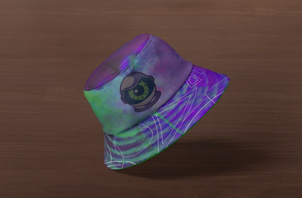
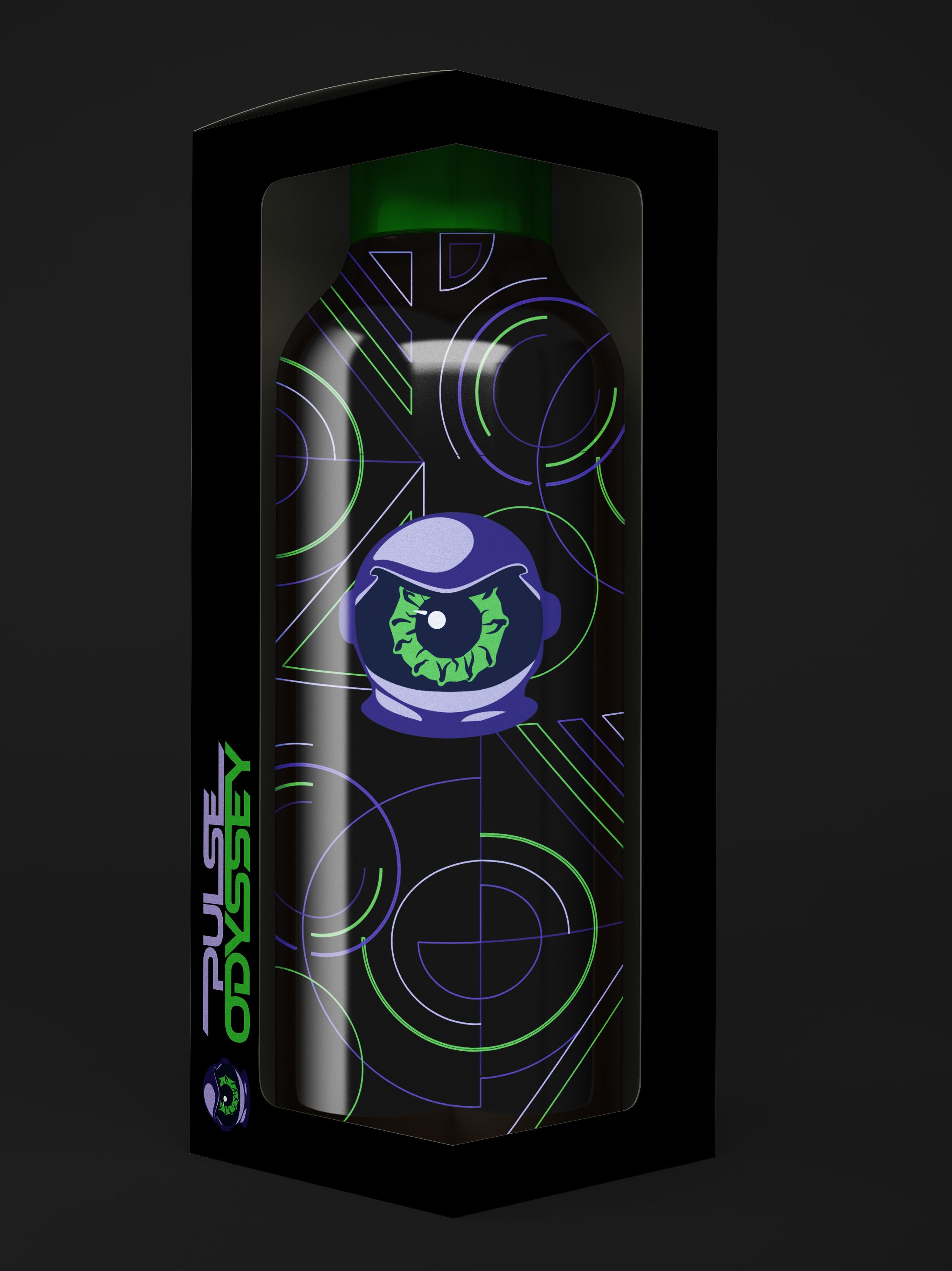
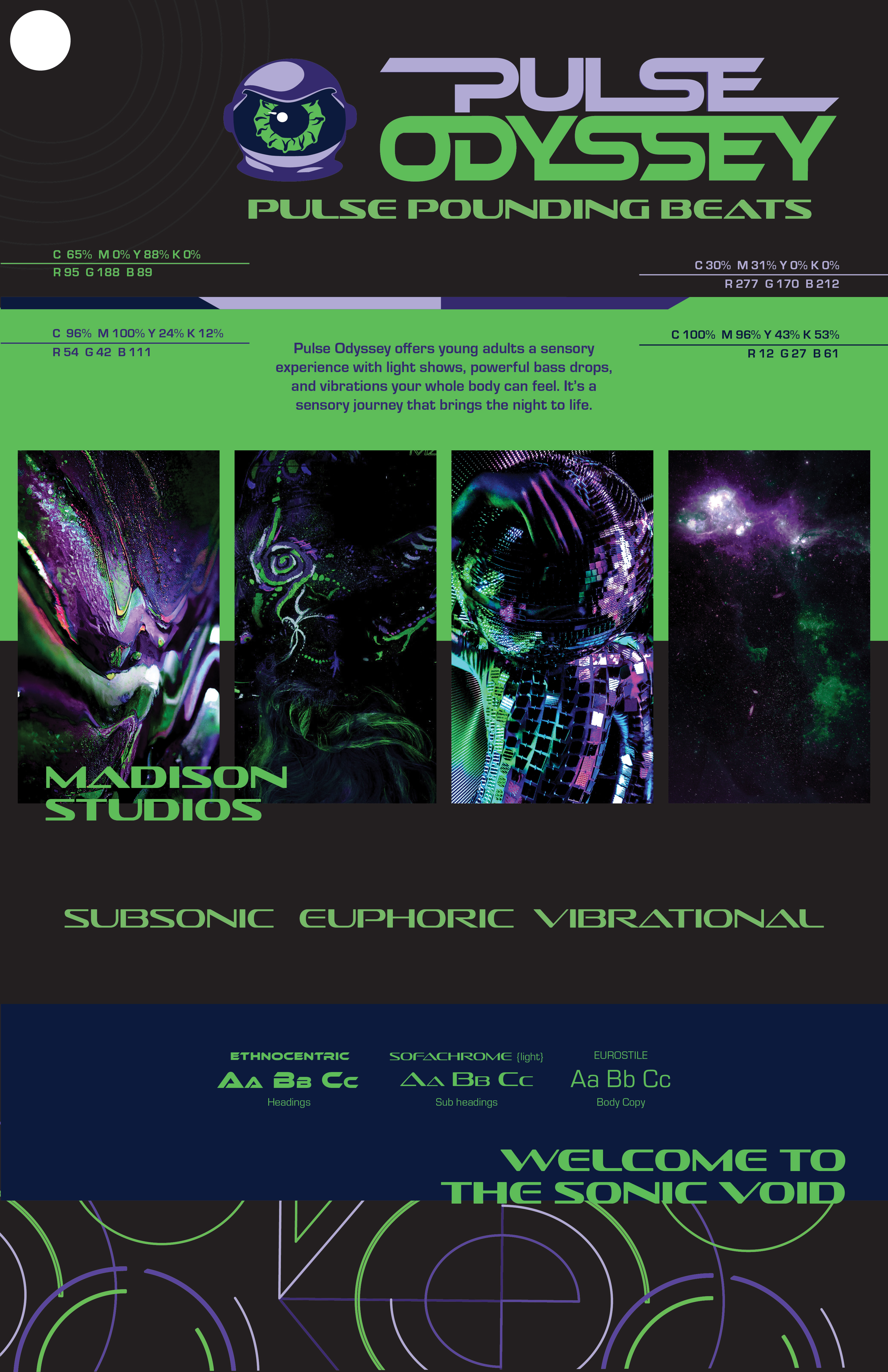
Pulse Odyssey’s color palette ensures professional-grade consistency and guarantees multi-platform readiness. The brand’s line and shape command attention and foster connection in a saturated EDM market. Textures include galaxy-inspired visuals, resin-like fluid textures, and atmospheric depth to bridge sight and touch. Brand imagery focuses on personal freedom, transformation, and euphoric movement. Integrated UV body art, mirror ball reflections, and cosmic glow effects to create movement resonance. Typography was chosen because it conveys futuristic, digital, high-impact feelings. It matches the bold, energetic brand promise of Pulse Odyssey.
Brand Media Assets
Early drafts conveyed the brand’s energetic spirit. However, they lacked the professional structural refinement. They also lacked the flow necessary for effective communication.


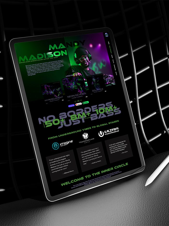
Pulse Odyssey Meet Mandy Page: Creates a strong emotional connection between the artist and audience while validating Mandy Madison’s authority in EDM culture


The logo animation immerses audiences immediately into the Pulse Odyssey experience and prepares them for the sensory journey the brand delivers.


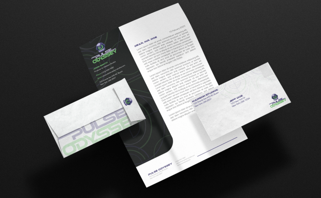
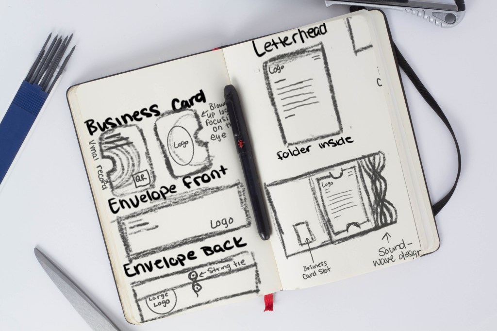
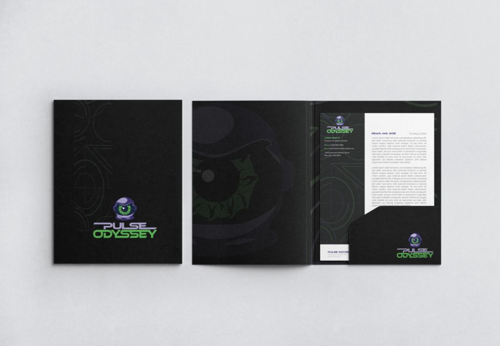
The Pulse Odyssey stationery package evolved from an energetic but structurally imbalanced concept into a clean, futuristic, and highly functional brand system. The final stationery suite has undergone strategic refinement. It focuses on visual hierarchy, brand cohesion, and usability.


Website Development
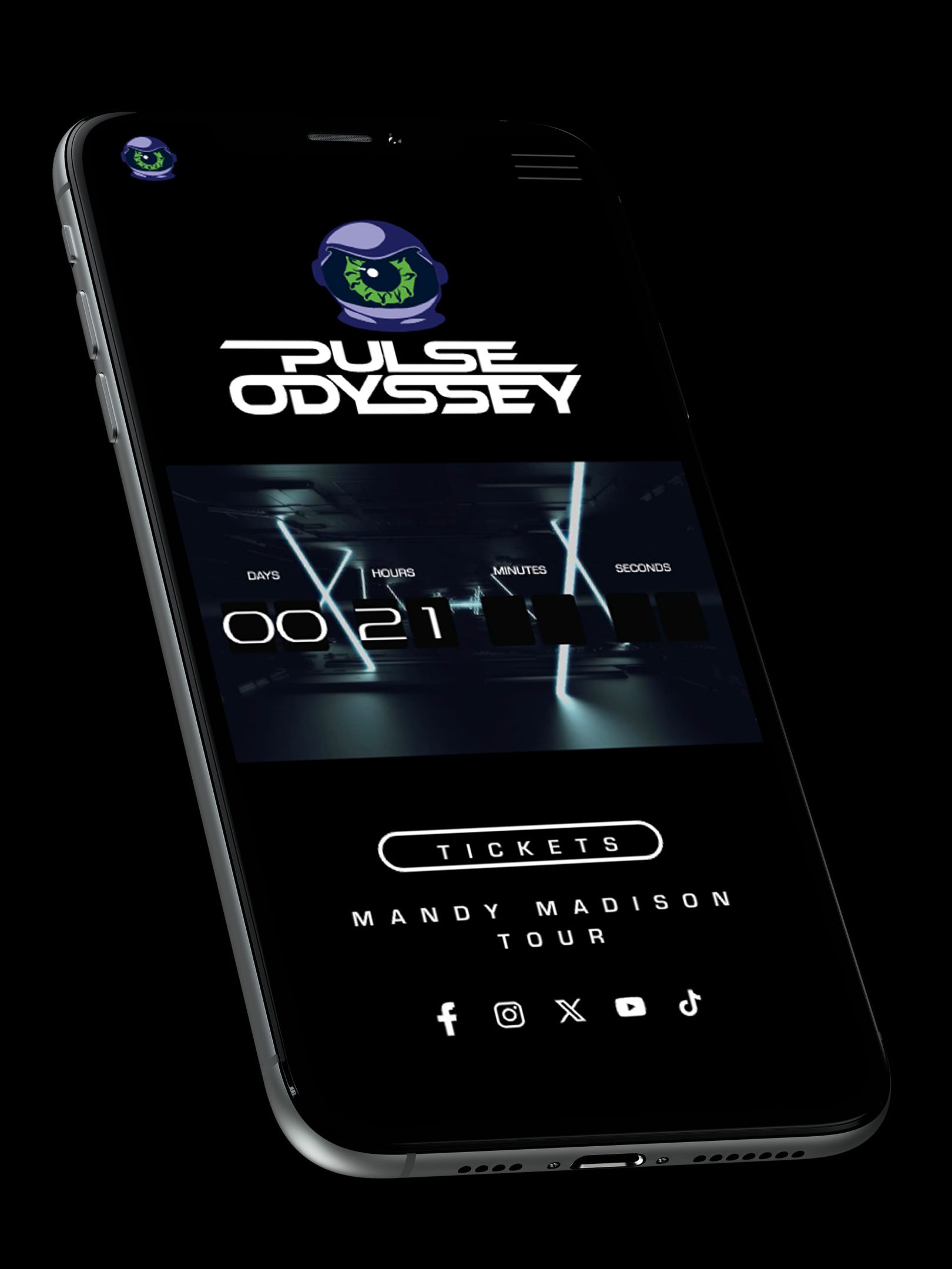
Pulse Odyssey Home Page: The full-screen countdown and dynamic visuals establish immediate sensory immersion aligned with Pulse Odyssey’s high-energy brand messaging
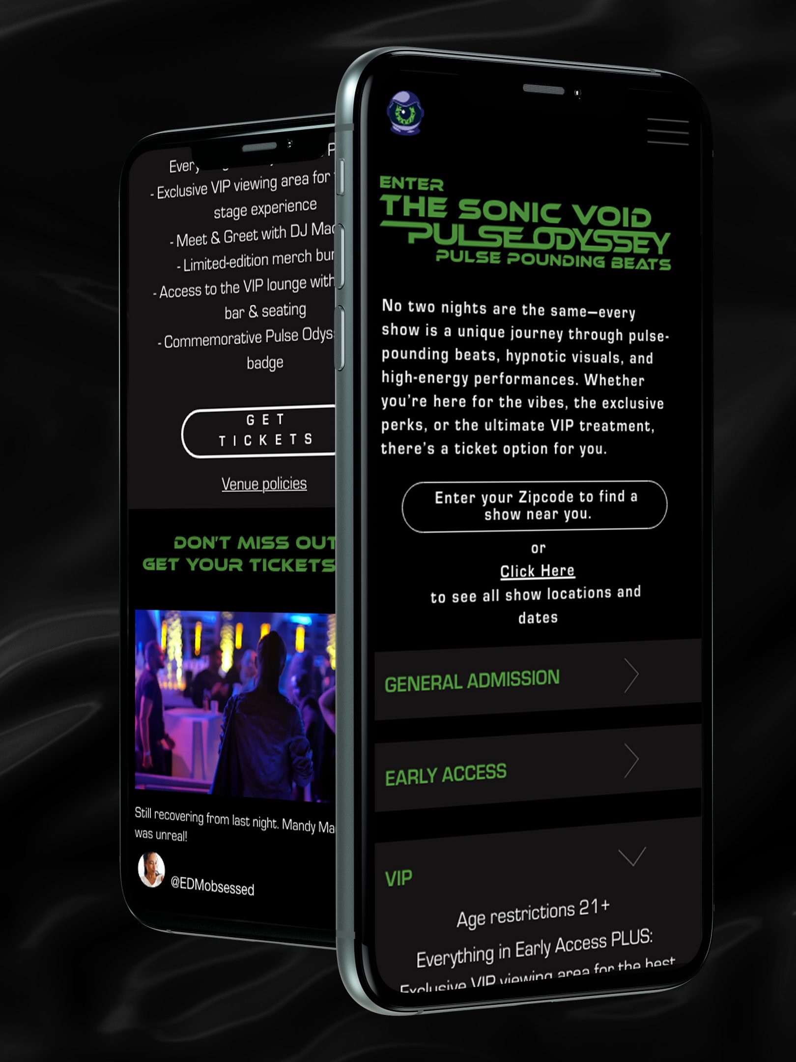
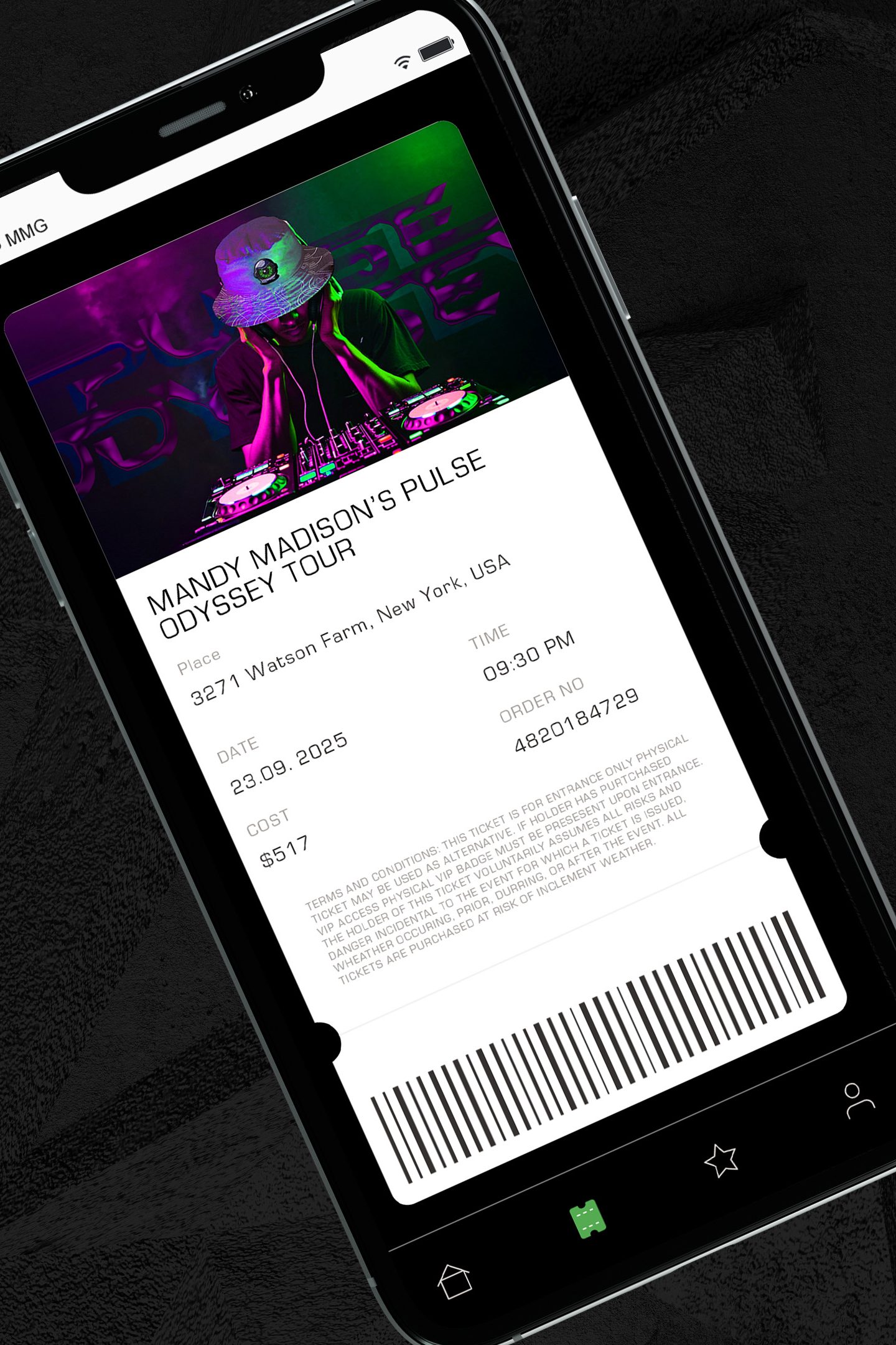
Pulse Odyssey Ticket Page: Three clear ticket tiers drive fast decision-making while reinforcing the brand’s energetic identity at every interaction.